Photo: McLaren, image taken from the Motor1 article gallery.
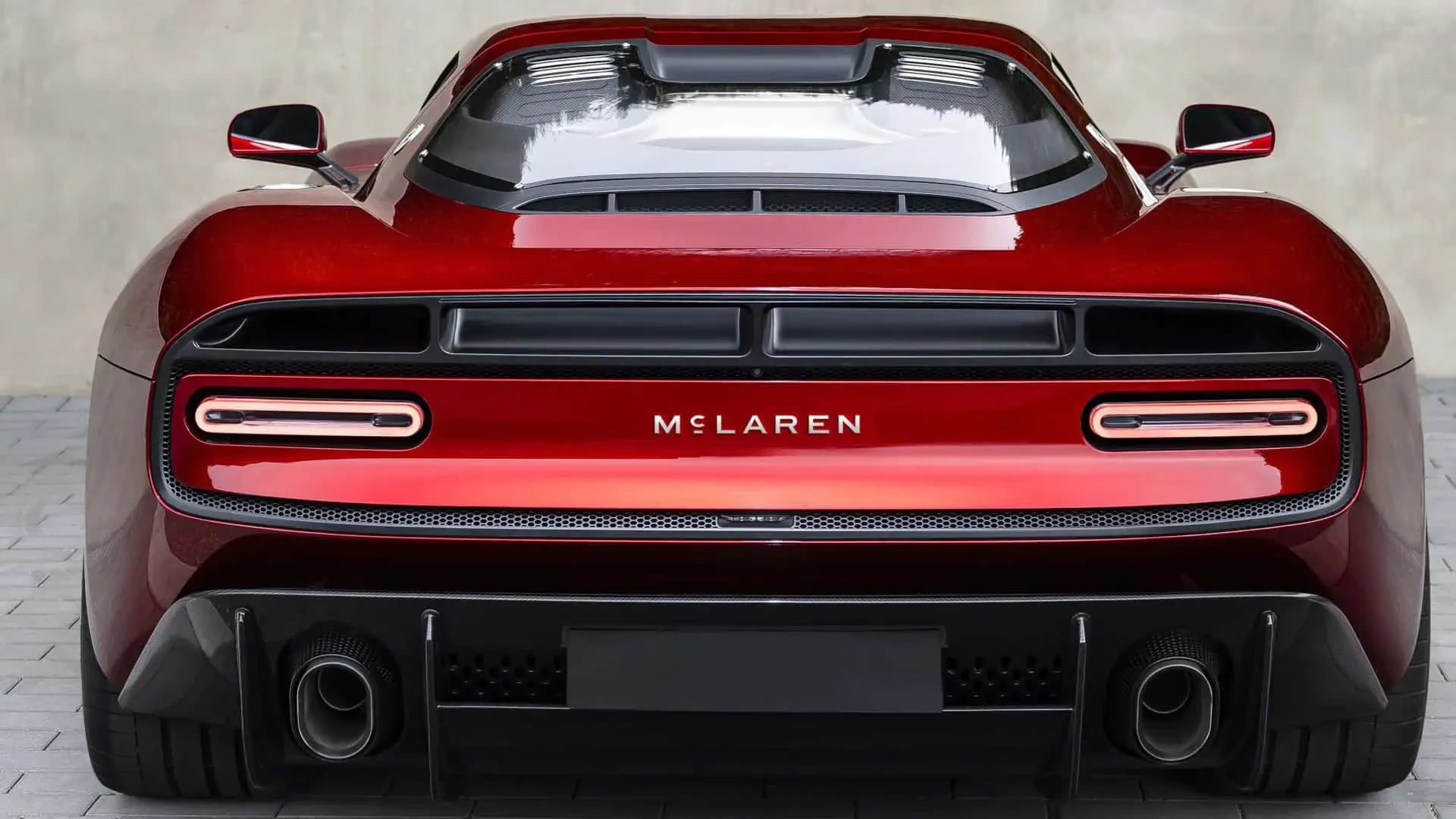
McLaren has revealed an evolved visual identity covering both McLaren Automotive and McLaren Racing. The most visible change is a new wordmark inspired by the sign above Bruce McLaren’s family service station in Remuera, Auckland. The Speedmark remains a central part of the brand, while papaya continues to be McLaren’s defining colour.
The timing is linked to a broader product and business plan. McLaren is preparing to move beyond the two-seat, mid-engined sports cars that have shaped its modern road-car image, including with a performance SUV. The company also says it plans a £500 million investment programme to expand its UK manufacturing and engineering footprint. The logo announcement itself does not include a price, power figure or launch date for the SUV.
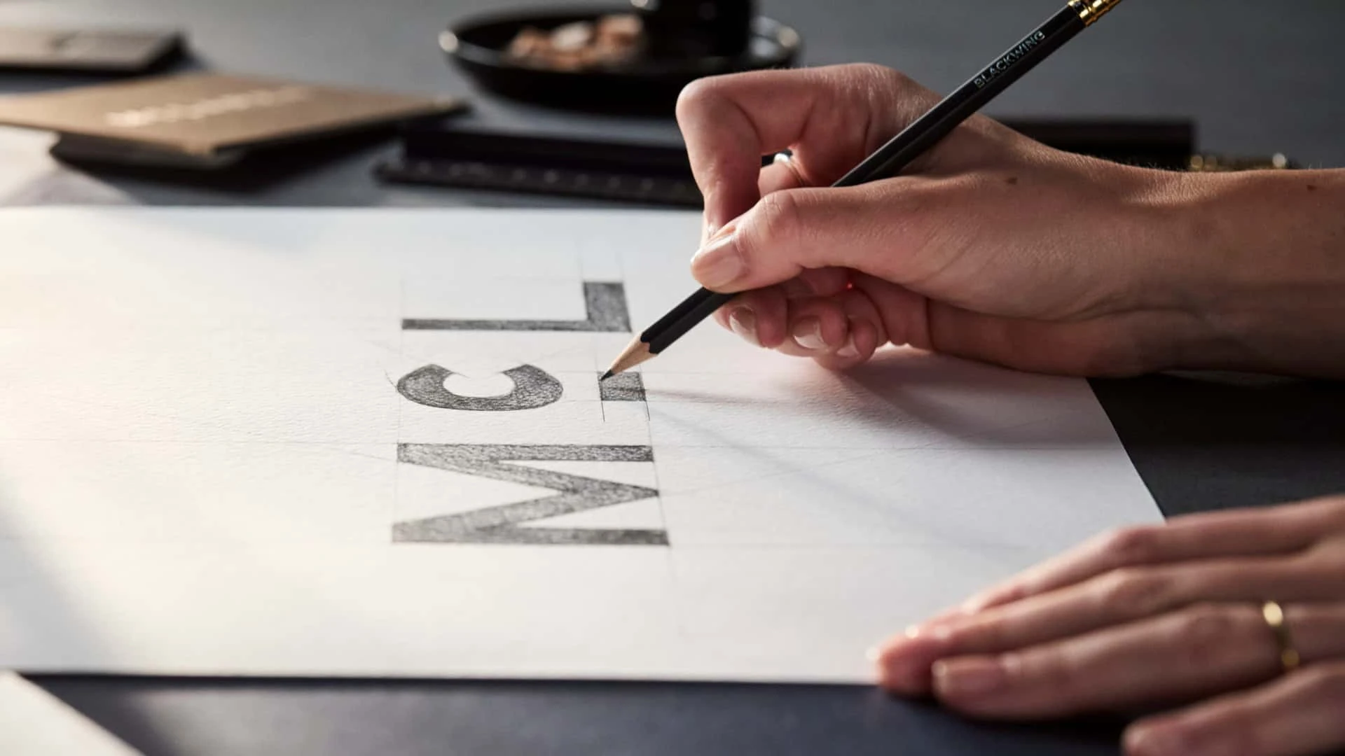
Photo: McLaren, image taken from the Motor1 article gallery.
A new wordmark with an old reference
McLaren says the new wordmark draws on the lettering used above the service station owned by Les and Ruth McLaren, Bruce’s parents. The site in Remuera was where Bruce built the car that took him to his first racing victory. By reworking that visual reference, McLaren is connecting a modern corporate identity with the period before the name became a global motorsport and road-car marque.
The company is not presenting the update as a rejection of its current image. McLaren Automotive and McLaren Racing reviewed their shared archives to identify symbols, stories and design details that have remained meaningful over more than 60 years. The new wordmark is therefore an adaptation of an origin story rather than a completely new name or visual system.
That distinction matters because the wordmark will appear in places that have little to do with a car badge. It will be used across vehicles, racing equipment, retail locations, digital services, customer material and fan products. A single identity has to work on a Formula 1 car, a road-going supercar, a future SUV and a mobile screen without losing legibility or the connection to McLaren’s racing history.
Speedmark and papaya remain
The Speedmark is staying. McLaren has used the symbol since 1997, when its streamlined form was linked to the vortices produced behind a racing car’s rear wing. It has since become one of the company’s most recognisable visual signatures. Keeping it gives the revised identity a direct link to the road cars and racing cars already familiar to customers and fans.
Papaya remains the defining colour, but McLaren is expanding the palette with shades inspired by important periods in the company’s history. The identity also retains the Speedy Kiwi, which references Bruce McLaren’s New Zealand roots. These elements give the brand a set of recurring components that can be combined differently across racing liveries, cars, clothing and digital applications.
The announcement is not a technical update to any current car. It does not change the performance, equipment or pricing of McLaren models already on sale. The practical effect will be seen in future badges, communication material, dealer environments and the way the Racing and Automotive divisions present themselves together.
Why the change arrives now
McLaren has traditionally been associated with low, two-seat, mid-engined sports cars. The company has now confirmed plans for a performance SUV, a format that requires a different visual and commercial language. The new identity is intended to operate across that wider range while preserving the symbols associated with McLaren’s past.
The official announcement links the next phase to a £500 million investment programme for the company’s UK production and engineering capacity. McLaren has not published a breakdown of the programme, so it cannot yet be used to infer a specific battery, engine or manufacturing plan. It confirms an industrial direction, not a complete product specification.
Motor1 reports that the SUV is expected before the end of the decade, but McLaren’s identity release does not give an exact launch date. It is therefore important to distinguish between a confirmed product direction and a detailed schedule. The company has not announced the SUV’s dimensions, powertrain, price or final name.
McL 6GT will introduce the design
McLaren identifies the McL 6GT as the first model to feature the updated logo. Motor1 connects the car with a more practical direction for the range and reports a manual gearbox, but the official identity announcement is not a full technical specification. The confirmed point is that the 6GT will be the first production contact between the new graphic system and a McLaren road car.
That application will be watched because a car with a broader brief must still look like part of the same family as a two-seat supercar. The logo alone cannot provide that continuity. Body design, cabin materials, dealer experience, software and the relationship between road-car and racing programmes will do more to define how convincing the expansion feels.
A shared story across the company
McLaren’s 2026 narrative includes renewed attention to Bruce McLaren, the M6GT as an early expression of his road-car ambition, the McL 6GT, the team’s 1000th Formula 1 Grand Prix and the development of a WEC Hypercar. These projects belong to different areas, but the company uses them to explain a single line from its New Zealand origins to its next phase.
For customers in Europe, the logo change has an immediate visual effect but does not itself create new availability or pricing information. Those details will have to come with the 6GT and the future SUV. Until then, the new wordmark is best understood as the public marker of McLaren’s planned expansion, with its most recognisable symbols deliberately kept in place.